
# Optional matplotlib backend selection here
# %matplotlib inline
# %matplotlib notebook
# %matplotlib widget
Matplotlib
There are lots of plotting libraries in Python, but the most popular one is matplotlib. It was designed (for good and bad) to look like Matlab. It's slow, and ugly/old in some ways, but it is powerful and ubiquitous. It has a diverse set of backends for almost any occasion, and it has great integrations into everything, including Jupyter Notebooks. It's also still under active development, so it's a safe choice for the future.
Non-graphical backend (Only for saving files)
import matplotlib
matplotlib.use('Agg')
You can find lots of other backends here.
Jupyter notebook
Jupyter has evolved much more quickly than matplotlib, so there are several ways to use it:
Direct use
First, try just using it. If you are on the latest versions of Juptyer/matplotlib, you should get a usable non-interactive backend.
Magic integration
You can use magics built right into Jupyter (one of the few external packages to have custom default magics) to set a backend. This is usually easier in a notebook the the manual method of setting a backend.
%matplotlib --list   # list available backends
%matplotlib inline   # traditional
%matplotlib notebook # interactive
%matplotlib widget   # lab-style interactive
%matplotlib --list
import matplotlib.style

print(matplotlib.style.available)

# Uncomment to try a different style:
# matplotlib.style.use('seaborn')
You can write your own style files, either locally or for use in your system. See the docs. You can also change parts of the style by hand in your code (we'll do that later).
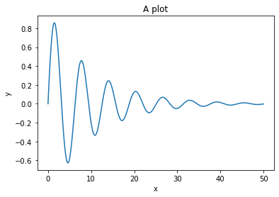
import matplotlib.pyplot as plt
import numpy as np

x = np.linspace(0, 50, 500)
y = np.sin(x) * np.exp(-0.1 * x)
# Matplotlib will make a figure if you don't make one yourself
# on *most* backends. We'll make one explicitly to make sure.
plt.figure()

# The thing inside the figure we see the plot on is called an
# axes (plural) - it will get created for you if you don't make one.

# Now, make the y vs. x plot
plt.plot(x, y)

# We always should add labels
plt.xlabel("x")
plt.ylabel("y")
plt.title("A plot")

# Some backends let you skip the "show". You can save *before* you show, not after.
plt.show()

# You can use plt.figure then plt.axes, but the easiest way
# is to make them both at the same time:

fig, ax = plt.subplots()  # Defaults to 1 subplot

# You intact with the axes
ax.plot(x, y)

# You usually add `set_` to the other function names
ax.set_xlabel("x")
ax.set_ylabel("y")
ax.set_title("A plot")

plt.show()
fig, ax = plt.subplots()

(line,) = ax.plot([], [])
for xv, yv in zip(x, y):
    xdata, ydata = line.get_data()
    xdata = np.append(xdata, xv)
    ydata = np.append(ydata, yv)
    line.set_data(xdata, ydata)

ax.set_ylim(-1, 1)
ax.set_xlim(0, 50)

plt.show()

fig, ax = plt.subplots()
ax.plot(x, y)

# Will tighen up the plot based on the current labels, etc.
plt.tight_layout()

# plt.savefig('myfile.pdf')
plt.show()

Styling
There are (too) many ways to style a plot. Let's mention several and focus on a few:
Style sheets
Matplotlib has built in style sheets, and you can make your own mystyle.mplstyle files.
See https://matplotlib.org/tutorials/introductory/customizing.html for lots of info!
print(plt.style.available)
You can use a style globally with plt.style.use(name) where name can be one of these names, or a file path. You can set multiple styles; a style may not change everything available.
You can also set the style temporarily using a context manager (the with statement):
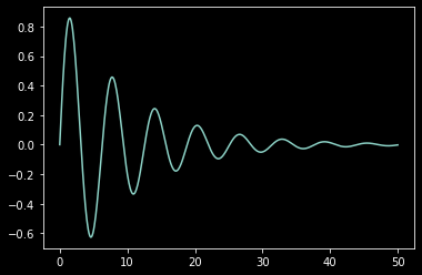
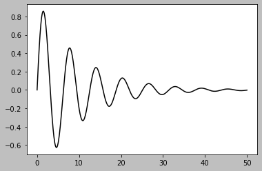
for style in plt.style.available[:2]:
    with plt.style.context(style):
        print(style)
        plt.figure()
        plt.plot(x, y)
        plt.show()
Writing a style file is simple, but probably not as useful for a quick plot or small changes. There are lots of ways:
matplotlib.rcParamsis a dictionary(-like) structure you can access like a dictionarymatplotlib.rc()is a weird function that makes it "easy" to save typing a few characters at great expense. (Can you tell my bias?)- Either
matplotlib.rcdefaults()ormatplotlib.rcParamsDefaultshas the original defaults.
There are lots of ways to work with a dictionary structure, as well:
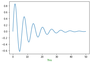
import matplotlib as mpl

mpl.rcParams["axes.labelcolor"] = "green"
plt.plot(x, y)
plt.xlabel("This")
A better way?
my_settings = {"axes.labelcolor": "yellow"}

mpl.rcParams.update(my_settings)
plt.plot(x, y)
plt.xlabel("This")

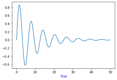
You can also set colors inline. Be careful; you are mixing function (the plot) and style (the colors, in this case). It is usually better to specify the two clearly separated, but this does have uses:
plt.plot(x, y)
plt.xlabel("That", color="blue")
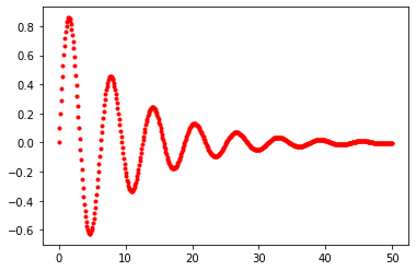
One exception: Colors of the lines. Normal matplotlib does not set this with one color, but a cycle of styles! So this is often easier to set inline using a custom "format string":
plt.plot(x, y, "r.")
Overall, matplotlib is not as beautiful to write code for as some of the flashy new tools, but it is powerful and mature, with lots of backends - you should at least know how to use it.
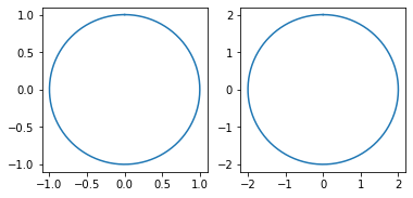
def circle_plot(radius=1.0, ax=None):
    if ax is None:
        fig, ax = plt.subplots()

    vs = np.linspace(0, np.pi * 2, 200)
    xs = np.sin(vs) * radius
    ys = np.cos(vs) * radius

    return ax.plot(xs, ys)
fig, ax = plt.subplots()
circle_plot(1.0, ax=ax)
circle_plot(1.5, ax=ax)
circle_plot(2.0, ax=ax)
ax.set_aspect("equal")
plt.show()

fig, axs = plt.subplots(1, 2)
circle_plot(1.0, ax=axs[0])
circle_plot(2.0, ax=axs[1])
for ax in axs:
    ax.set_aspect("equal")
plt.show()
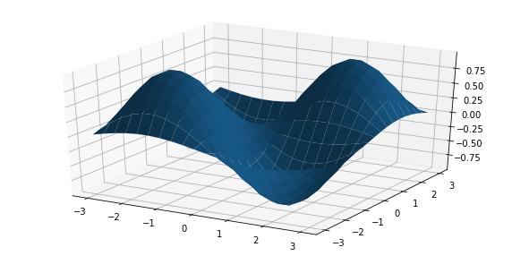
# Included with matplotlib
from mpl_toolkits import mplot3d
X, Y = np.mgrid[-3:3:20j, -3:3:20j]
Z = np.sin(X) * np.sin(Y)
fig = plt.figure(figsize=(10, 5))
ax = plt.axes(projection="3d")
ax.plot_surface(X, Y, Z)
fig, ax_left = plt.subplots()
ax_right = ax_left.twinx()

ax_left.plot(x, np.sin(x / 2), "r")
ax_right.plot(x, np.cos(x / 4) * 2, "g")

ax_left.set_ylabel("sin(x/2)", color="r")
ax_left.tick_params("y", colors="r")

ax_right.set_ylabel("2 cos(x/4)", color="g")
ax_right.tick_params("y", colors="g")

plt.show()
